There are affiliate links on this website. At no additional expense to you, I might receive a tiny commission.
This article shows Top 20 Home Interior Color Trends for 2026
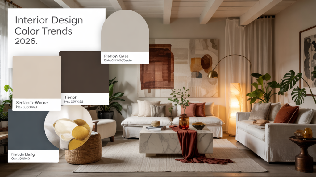
Haven’t heard? The interior paint colors of 2026 are unlike the grays that dominated every home flip over the previous ten years. Warmer color schemes, such as terracotta, sage, and those buttery neutrals that make a space feel pricey without actually costing a fortune, are becoming increasingly popular among designers. One thing unites the popular wall colors found in modern homes: they are livable. Nobody wants a living room that looks great for about three days before feeling completely wrong. These modern interior color trends work because they complement natural light instead of fighting it. Warm neutral interior colors anchor a space while bolder accent shades add personality where it counts. The best interior colors for modern homes balance trendiness with staying power, which matters when repainting means burning a whole weekend.
Here are Top 20 Home Interior Color Trends for 2026
1. Cloud Dancer (Soft White / Off-White) – Pantone’s Color of the Year
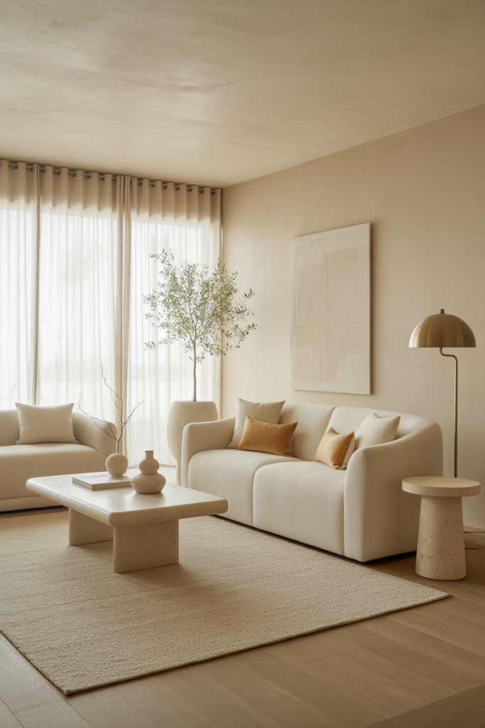
Pantone picked Cloud Dancer for 2026, which beats another year of stark white walls. This soft off-white actually has some warmth to it instead of feeling like a blank hospital room. Works with any furniture style thrown at it—modern, traditional, whatever’s already sitting in the living room.
2. Universal Khaki – Cozy Grounding Neutral from Sherwin-Williams
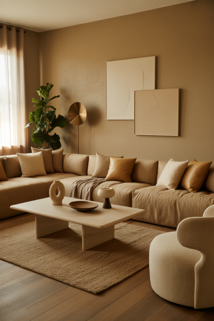
Sherwin-Williams nailed it with Universal Khaki. This warm tan makes rooms feel grounded without going dark or heavy. Shows up everywhere in 2026 palettes because it plays nice with practically every other color. Way better than beige ever was.
3. Warm Eucalyptus (Soft Muted Green) – Nature-Inspired Green That Feels Soothing
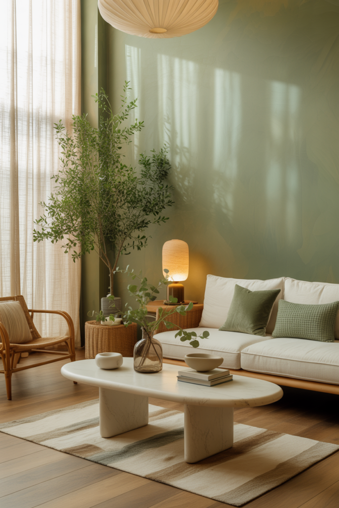
Nothing like the bright minty greens from decades past. Warm eucalyptus is muted, calming, and way easier to live with. Brings that nature-inspired vibe without making a bedroom look like a yoga studio. Just soothing in the right way.
4. Deep Teal / Teal Blue-Green – Rich, Serene and Versatile
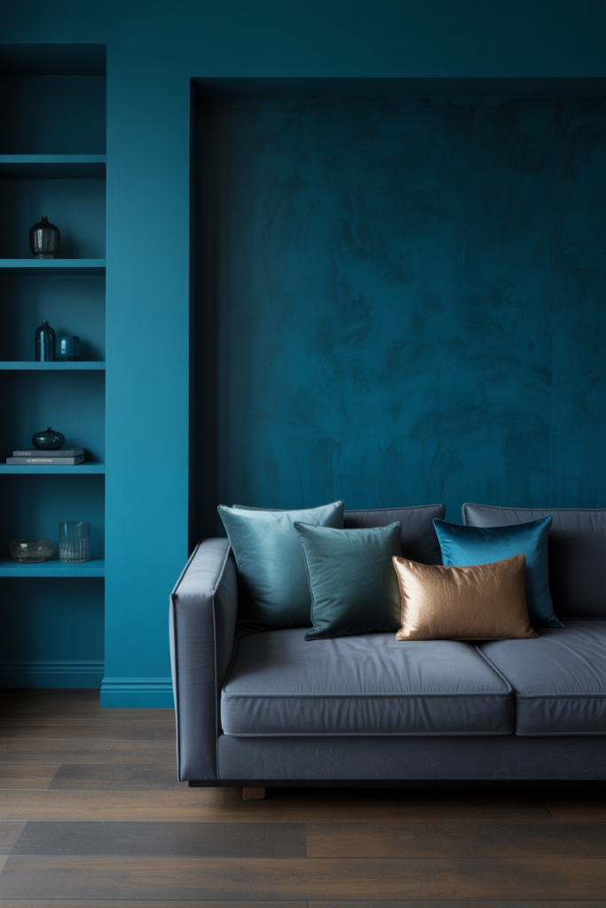
Deep teal does double duty—rich enough for drama, calm enough for everyday living. Works as a full room color or just one accent wall. This blue-green is all over interior design right now because it doesn’t box itself into one specific style.
5. Tranquil Teals – Broader Teal Family Bringing Calm Sophistication
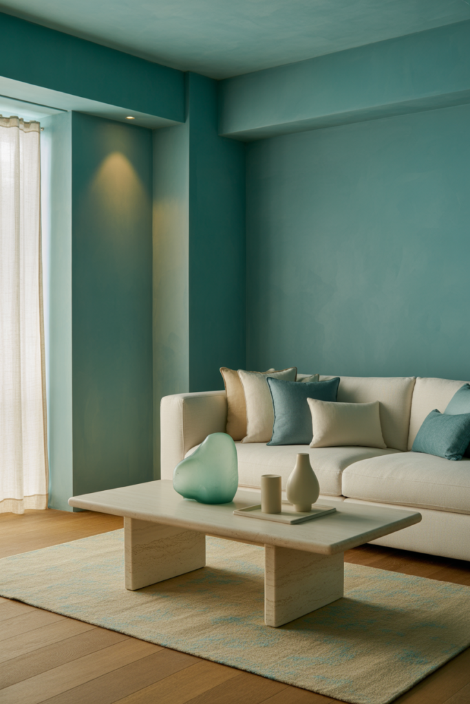
The entire teal family is trending hard. Lighter aqua shades, deeper jewel versions—all of them bring that calm, sophisticated feel. Bathrooms and bedrooms are getting these colors because who doesn’t want peaceful spaces where it actually matters?
6. Earthy Dark Greens – Deep Nature-Connected Greens Anchoring Spaces
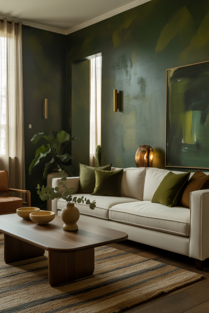
Forest green and hunter shades are replacing black in a lot of homes. These deep greens anchor a space without the heaviness. They’re nature-connected without looking like a hunting lodge exploded in the living room. Just grounded and livable.
7. Moss Green – Organic, Calming and Earthy
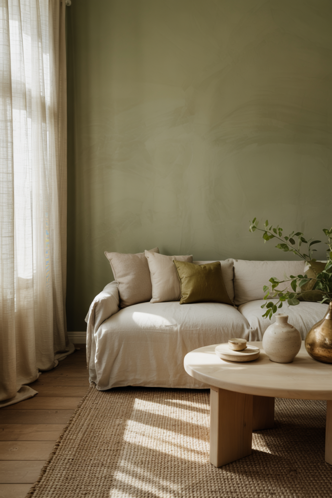
Moss green sits between bold and boring perfectly. It’s organic, definitely earthy, and calmer than brighter greens. Keeps showing up because it adds color without taking over the whole room. That’s a win for anyone tired of all-white everything.
8. Earthy Browns & Chocolate – Warm and Cozy Neutrals Replacing Black.
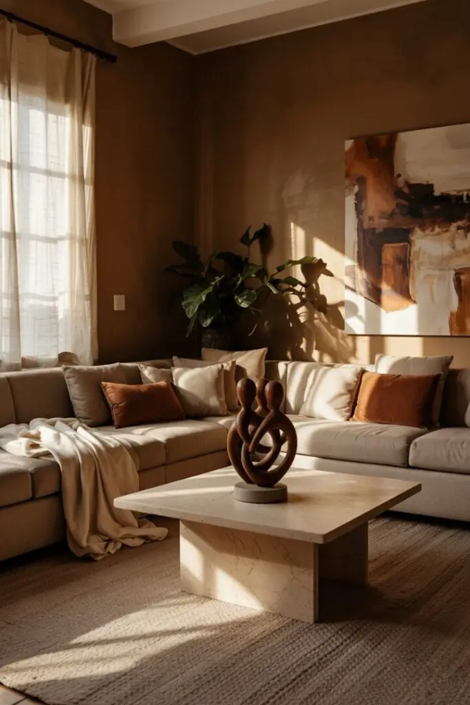
Chocolate brown is the new black, basically. Warmer, cozier, and less harsh than black trim or cabinets. These rich browns ground a space the same way black does but without making everything feel heavy. Finally, a dark neutral with some warmth.
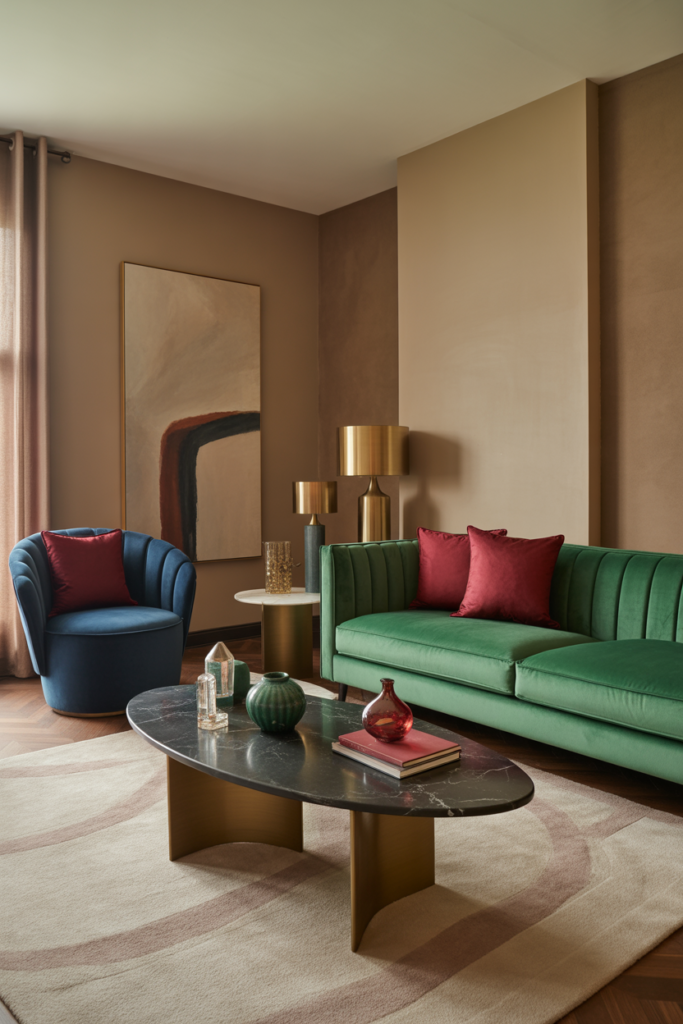
9. Rich Burgundy & Wine Reds – Moody, Elegant Accent or Main Wall Colors
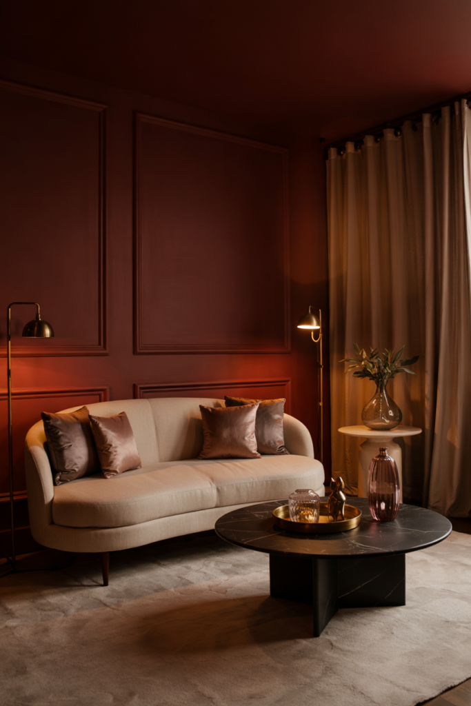
Wine reds aren’t messing around. These burgundy shades make bold statements as accent walls or—for anyone feeling brave—entire rooms. Moody and elegant without crossing into too-much territory. Takes guts but the payoff is worth it.
10. Deep Plum & Berry Tones – Luxurious Jewel-Like Purples
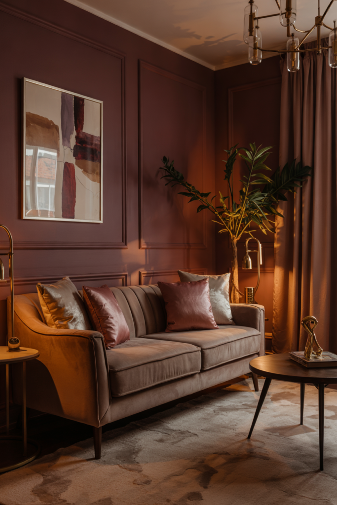
Purple finally grew up and got sophisticated. Deep plum and berry tones look luxurious instead of juvenile. These jewel-like purples work in dining rooms and offices where a little drama helps. Not the purple anyone remembers from childhood bedrooms.
11. Warm Yellow & Ochre – Vibrant Yet Grounding Yellow Hues
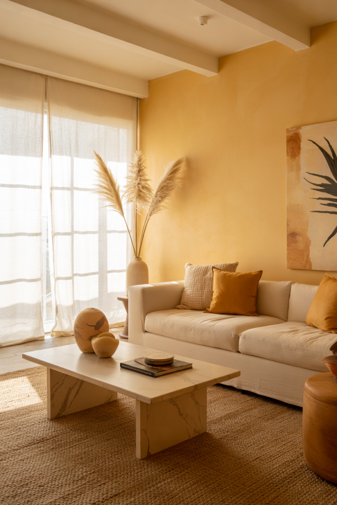
Yellow doesn’t have to assault the eyeballs. Warm ochre is vibrant but grounded—energizing without being overwhelming. Perfect for kitchens and entryways where a welcoming vibe actually matters. These golden yellows just feel good walking into.
12. Muted Pastels – Refined Soft Hues with Calming Appeal
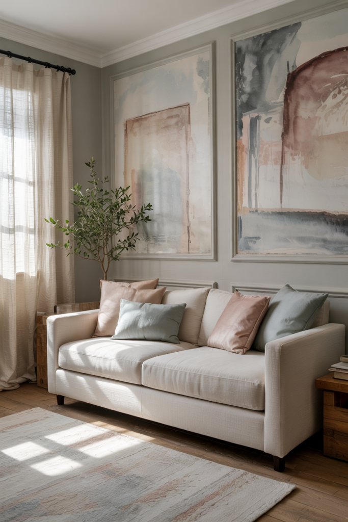
Pastels got a grown-up makeover. Powder blue, soft sage, dusty rose, lavender mist—all the muted versions that don’t feel sugary sweet. These refined shades calm a space down without the cuteness factor. Way more sophisticated than the pastels from before.
13. Soft Sky & Powder Blues – Gentle, Restorative Blue Tones
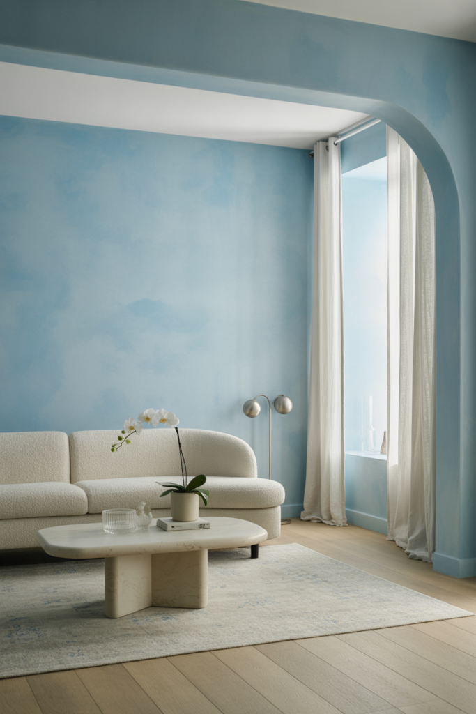
Light blues came back but gentler this time. Soft sky and powder blue feel restorative in bedrooms and bathrooms. They open up tight spaces without that cold, icy blue feeling. Just peaceful and airy in the best way possible.
14. Nature-Infused Neutrals (Sand, Taupe, Almond, Oatmeal) – Warm Neutrals Tied to Nature
Sand, taupe, almond, oatmeal—these are killing off gray in every room. They’re warm but not that dated nineties beige. Organic feeling neutrals that work with natural light instead of fighting it. Create calm spaces without being boring about it.
15. Greige & Taupe Undertones – Balanced Neutrals with Sophistication
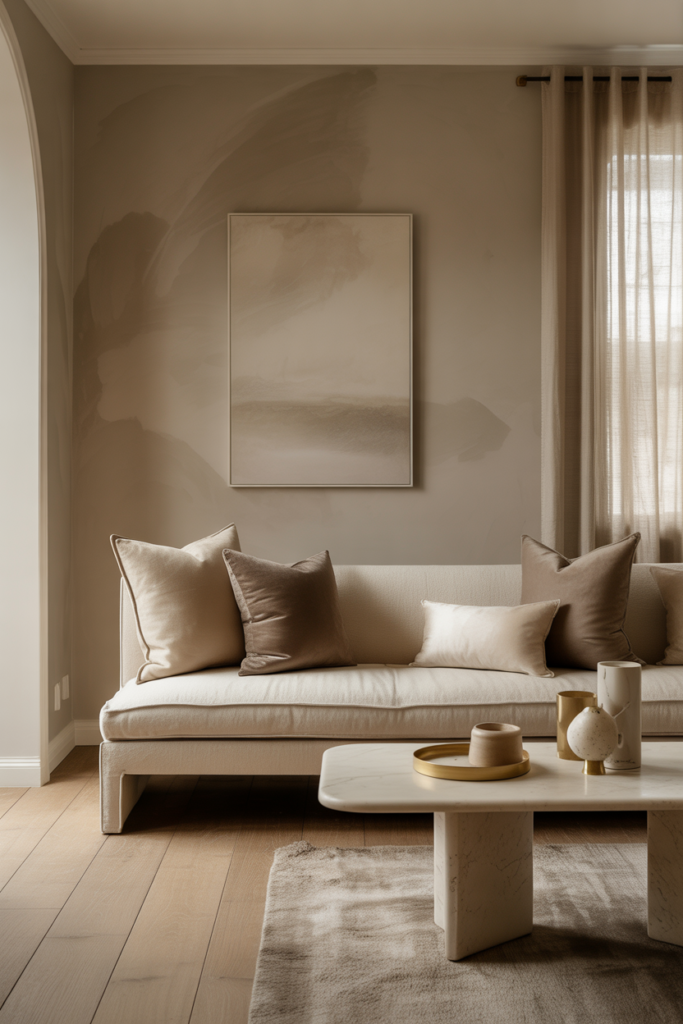
Greige stuck around but got warmer with taupe undertones mixed in. This balanced neutral adapts to different lighting all day without looking like a completely different color. Sophisticated without trying too hard. Still safe, just better than plain gray.
16. Sour Lime / Acid Greens – Bold, Electrifying Accent Color
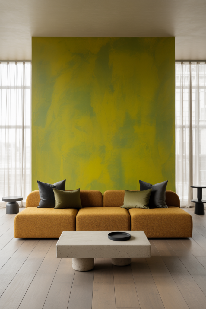
Not for wimps. Sour lime and acid green are electrifying—best used on one wall or inside built-ins. These bold greens need confidence because they absolutely wake up boring spaces. Small doses, big impact. Takes guts but worth it for the right room.
17. Black & Charcoal (Nocturnal Black Shades) – Dramatic Accents or Feature Walls
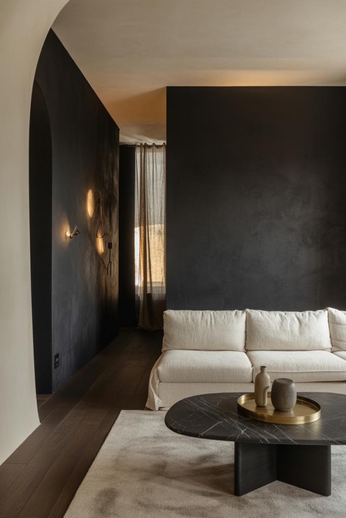
Black came back smarter this time. Nocturnal black and charcoal work as feature walls or on trim without making rooms feel like dungeons. Strategic use for contrast instead of painting everything dark. Grounding without the heaviness that scared people off before.
18. Deep Navy & Rich Blues – Classic Yet Modern Dramatic Hues
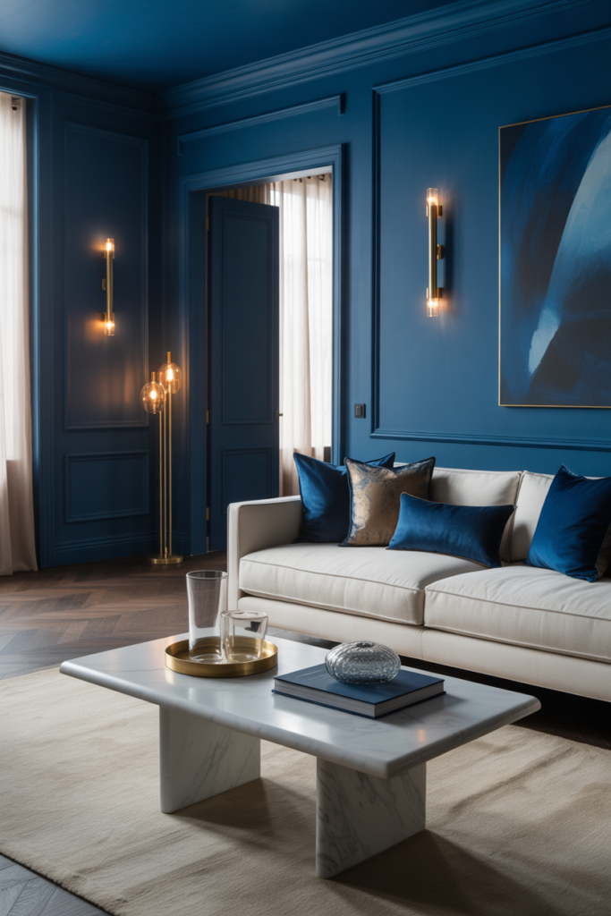
Navy never really disappeared but these deeper rich blues feel more dramatic now. Classic enough for traditional homes, modern enough for contemporary ones. Home offices and dining rooms are eating this color up. Bridges styles without breaking a sweat.
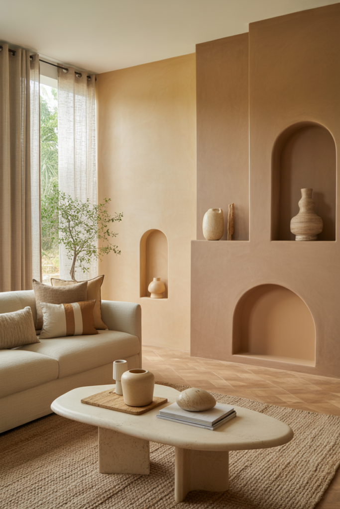
19. Warm Rust & Terracotta – Earthy, Vibrant Accents with Warmth
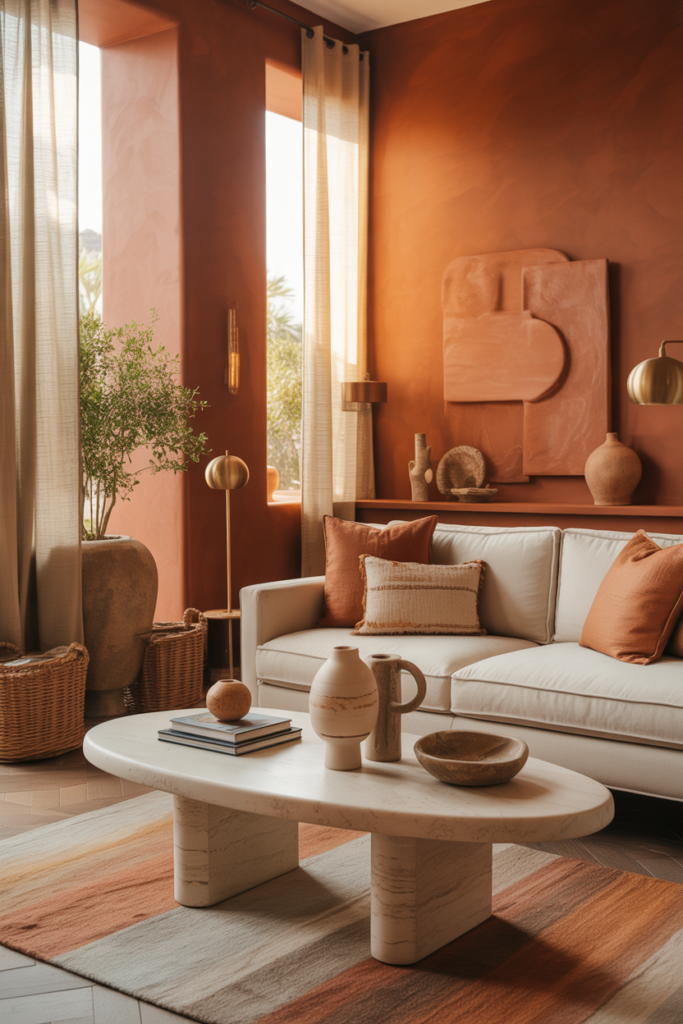
Terracotta and warm rust bring earthy vibrancy without yelling about it. Great as accent walls or mixed into textiles and accessories. These rusty tones add warmth and work with both neutral palettes and bolder color schemes. Just versatile and interesting.
20. Jewel Tones – Pops of Luxurious Color for Accents or Furniture
Emerald, ruby, sapphire—jewel tones are popping up on furniture, built-ins, and strategic accent walls. That one saturated punch of luxurious color without redoing entire rooms. Rich, elegant, and way more interesting than another neutral piece of furniture.
Final Thoughts
Paint does more to transform a space than most people realize. These home interior color trends 2026 lined up aren’t the kind that look amazing for two weeks before feeling completely wrong. They’re colors that hold up in actual houses where coffee gets spilled and kids drag their hands along hallways. Some lean warm and grounding. Others go bold without crossing into regret territory. The best interior colors for modern homes balance what’s current with what’ll still work next year. Pick based on how a room actually gets used instead of what looks good in a magazine spread. A fresh coat in the right shade beats buying new furniture any day.
Which color is actually getting tried first? Tell everyone in the comments which trending wall color caught attention. Pin the good ones so they’re easy to find later when the paintbrushes come out, and send this to whoever keeps complaining their house feels boring.
Images by : DollHouseWow